Sol Sender, who led a design team for the Obama 08 logo, was recently interviewed about the project.
Here’s a walk through the various logo options, with some of Sol’s thoughts. The full interview videos can be watched on the website of VSA Partners (where Sol is now a strategist).
Obama logo option #1
Obama logo option #2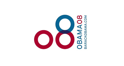
Obama logo option #3
“We did see the O as standing for something beyond just the first initial of the candidates name.”
Obama logo option #4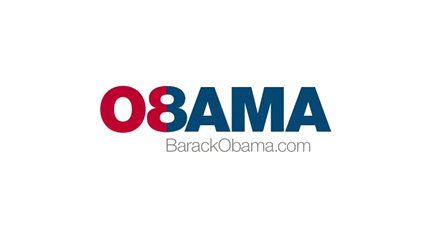
“There was an idea of unity that emerged, particularly when we began to look at the red and blue, and how they intersected.”
Obama logo option #5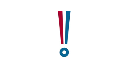
“Before we even arrived at the final identity we were aware of developing a number of options that had an element that stood separate from the typography.”
Obama logo option #6
“We developed a lot of logos. Usually we only develop two to four, maybe five. There were fifteen, sixteen options, and we focused on three.”
Three finalist logos
Obama logo finalist #1
“This masking of different photos with the O shape became an opportunity to say different things in different moments… The O could contain all these different ideas, possibilities and feelings.”
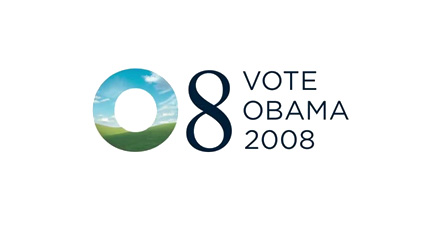

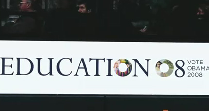
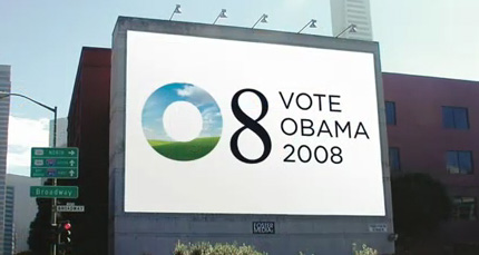

Obama logo finalist #2
“There was a lot of excitement about this. People felt this was really something new, something different. It was a kind of populist expression — everyone’s excited about Obama, people are talking… (but) it was a little too far out of the box. We felt that having a little more tradition in the mark was the smart way to go.”
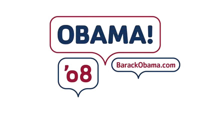

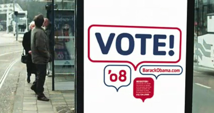
Obama logo finalist #3
“For me personally, this was always the one.”

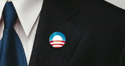

Originally the stripes were kind of symmetrically expressed across the horizon, and as we went into final refinements we felt that giving it a little bit more dimension, a little bit more motion, ways to enter into it a little bit more for the viewer was a better way to go.”

It’s interesting to note that Sol had never worked on a political logo before. A nice reference for when that Russian nesting doll client asks you how many Russian nesting doll logos you’ve created — don’t worry about saying, “None”.
Amanda Gentry and Andy Keene are two of the logo designers at Sender LLC who worked on the project.
In the second part of Sol’s interview, he talks about the viral nature of the campaign, and the many places the Obama logo appeared (Twitter, Facebook etc.).
One last quote from the intervew:
“The strongest logos tell simple stories.”
For an insight into my own logo design process, you can view my humble logo design portfolio on David Airey.com.


No comments:
Post a Comment